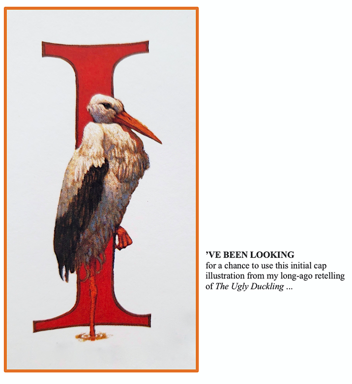
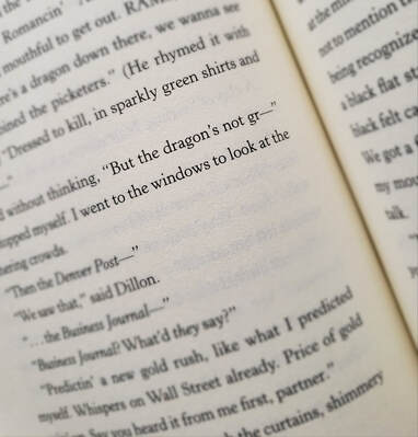
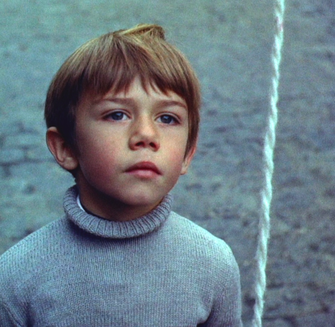
 That’s right. It isn’t, wasn’t meant to be. It’s what happens when book jacket designers don't have enough information. I created the art for the tale I wrote, where the first-person narrator and main character Kat says the dragon Ye is not gr — and stops herself. She doesn’t want anyone to know about her beloved friend, the last one on earth, who wishes to die in peace. Or live forever. Unfortunately, Kat thinks she’s already made that decision for him. At great personal cost. The Dragon of Cripple Creek is currently out of print, but please grab (politely) any copy you might come across, and enjoy. I worked a year on it, believing it worthy to spend a quick afternoon reading, experiencing Kat's world. Though her world is very like our own, there is this dragon ... (Ye is whispering in his smoker’s voice, “It was our world first.”) No, the dragon isn’t green. Reader kids have told me that. They notice when things don’t make sense. The final jacket works, it's just not true to the story. The original concept was to include a faded "Wanted" poster, but it's lost to the main image, so the dark background was a good choice. Problem is, this dragon isn't gr — I hope to get the book back in print before long, and I'll have the cover redone. 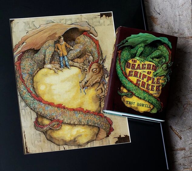 The digitally-altered jacket next to my actual art.
It's not a book I'm recommending this time, but a beautifully-written set of truths about writing.* A few of my favorite lines: "At any point in history there is a great tide of writers of similar tone, they wash in, they wash out, the strange starfish stay behind, and the conches. Emily Bronte was nine feet tall and had wings but everyone in that Victorian era was too proper to mention it ... I get to use the word turquoise or melting or supernova right now if I want."  * select the image to go to the article
 Now and then I’m asked what my first creative influences were, and I trace a significant one to a moment that shimmers in my childhood. I was eight, sitting enraptured for 34 minutes as I watched a film called The Red Balloon. This singular work sparked something in me I had no definition for but welcomed with all my heart. Captivating my vision like the story's balloon itself, its magic-infused realism showed me there are elements both within and beyond self as needful as breath. The story is an allegory, played out on Paris streets* by six-year-old Pascal (the filmmaker Albert Lamorisse’s son), who frees a red balloon that’s caught on a lamppost. Together, boy and balloon share the joys of companionship, the challenges of separation, rejection, escape, and finally, death and rebirth. This simple urban fairy tale — one of the earliest of its genre — captures basic desires of humanity. As we seek acceptance, purpose, gladness, we also hide at times, stumble, dash or press through constricting passages by twists and turns, run up steps, run down, all the while hoping to soar, ultimately, into a lasting place of peace. Yet there is also that portion of humanity too vast and common that disdains things beautiful and pure, that seeks in ways both physical and psychological to destroy what it neither understands nor possesses (which, I believe, is at the core of the foolish and bitter responses). In the film these are the masses, adults and children alike, who, at the least, display annoyance and indifference, and at the worst, mindless insensibility and harm. The result must ever be: death of the innocent, death by stoning. In the film, time stands still in silent horror at the withering of Pascal’s spirit friend. 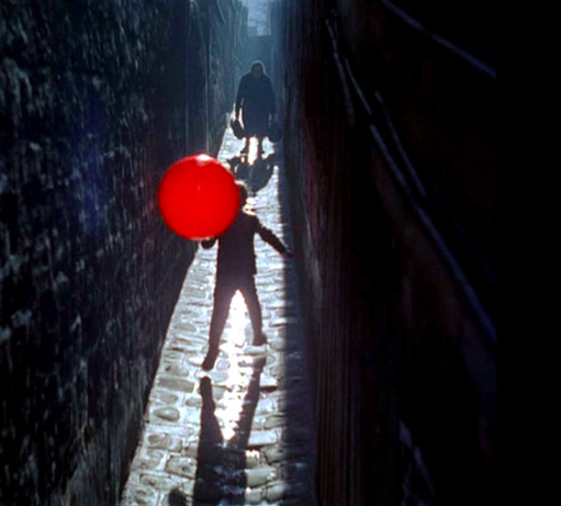 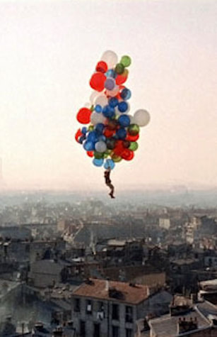
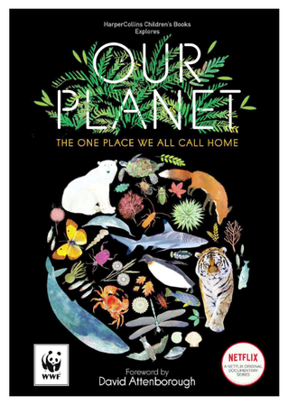
There is, however, a jubilant end to the tale, as a teeming cluster of balloons from all over Paris provides a resurrection. In visionary innocence, Pascal takes hold. This is what we wish for. For him; perhaps for ourselves. This is what fantasy realism can do: reveal secrets of the soul. Of life, death, and the spaces in between. Of character, choice, and consequence. Though not fully comprehending, children yearningly receive. As I have matured as a writer, I’ve found that almost everything I produce touches back to the glint of raw reality and sparkling truth I saw in The Red Balloon. * Nearly all of the homes and quarters, cafes and bakeries, steep steps and cobbled lanes among which the story was filmed are gone. I usually have an album or two playing during my writing process, chosen to set the tone and keep me in the spell of the work. When I wrote The Dragon of Cripple Creek, the music was American folk revival, plus early Dylan and Neil Young (for the energy). As I wrote my picture book story, Whale in a Fishbowl, I listened to one song alone on repeat, and that was Radiohead’s “Bloom.” Not until I was deep into the story creation did I realize the song was from a whale’s point of view. I had subconsciously chosen it. 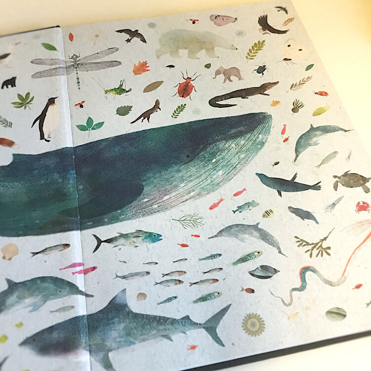 Richard Jones' endpaper illustration for the Netflix series book by Matt Whyman, Our Planet. The 2017 documentary series with David Attenborough, “Blue Planet II” has as its theme an orchestrated version of “Bloom,” a collaboration by Radiohead and Hans Zimmer. Now Richard Jones, the illustrator for Whale in a Fishbowl, has illustrated the children’s companion book to the related 2019 Netflix series, "Our Planet." As John Muir wrote, "When we pick out anything by itself, we find it hitched to everything else in the universe."
 And more about Whale in a Fishbowl, as a continuing series of posts, here. The book, now published in Korea, France, China, and Japan, will soon be published in the UK with foil typography and new cover art by Richard. More on that when it's ready. We all have them, and they often don't go as planned. So here's a New Year’s gift to my readers — a user manual for broken dreams. Presented in a pseudo-authoritative style, with FAQs and supplementary materials, including a poem by William Butler Yeats and short story by me, it may spark some inspiration as you move forward in 2020. To access the entire work, click on the printable PDFs. May your vision be clear and your dreams come true.
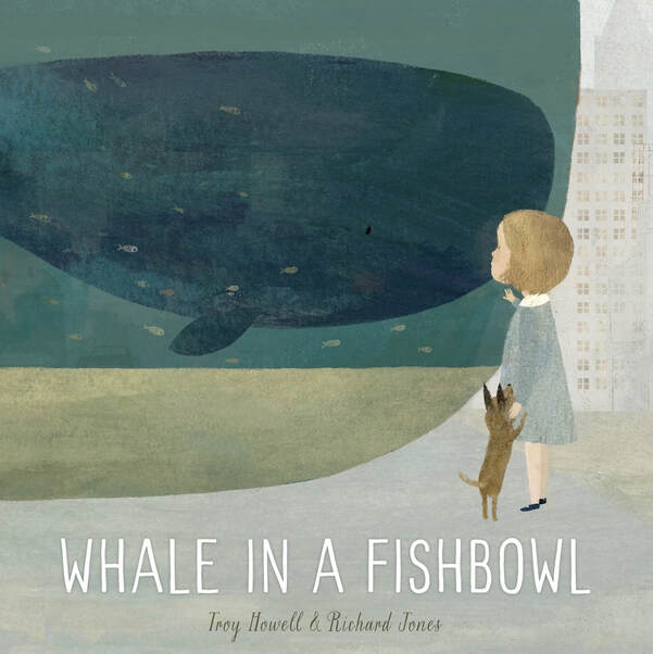
 Cover and a few sample pages.  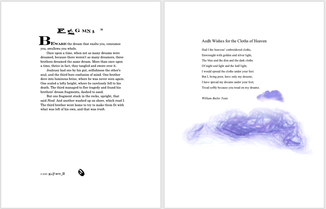  I like to analyze what I do. What I’ve done. Why it works. Or why it doesn’t.  Wednesday is the whale in my picture book, Whale in a Fishbowl. The story won the Golden Kite Honor award from the Society of Children’s Book Writers and Illustrators, the Northern Lights Book Award, has received starred reviews from four major reviewers, was Amazon's "Best of the Month" selection, and has been published in six countries, so it works for a lot of people. I want to reach my audience in the best way possible, putting something of value in their hands and hearts and minds. So I’ve been looking at Wednesday in order to help me with other stories I’m working on, and to share my process with fellow writers. I’ll first say what doesn’t work for me with Wednesday, and I speak only as a writer, not a marketeer. It’s the title. It’s utilitarian. There’s nothing poetic or lyrical about it. Had I gone with only my natural creative mind, I would have called it Wednesday’s Leap, which, in my view, is literary and appealing. But in this world where marketing is necessary, Whale in a Fishbowl makes sense. Why? It’s immediate. We know right away what the problem is. It gets us thinking, asking questions. On seeing the title alone, we probably have an opinion, even a feeling. Without having read the story yet, we may already have empathy for a whale who is trapped. That’s what works. The main character is in an impossible situation. And though the title is not the plot (Wednesday’s Leap is closer to that), it sets the stage, the anticipation, for the plot. As the story progresses, we learn that Wednesday doesn’t know she is trapped. When she’s drawn to the blue in the distance, which everyone knows is the sea (everyone but Wednesday) we’re rooting for her. Like the girl Piper, we want her to know that’s the sea she craves, and that’s where she belongs. We want her to be free. Another element that works is a twist before the climax. Before her final leap, Wednesday sees only gray (which we know is fog or smog). This adds an unexpected setback. We expect her to see the blue, as before. But this complication makes her try even harder. It raises the stakes. It raises the emotion within her and hopefully within the reader. She is on the verge of giving up, but will try one final time. If the blue isn’t there, she’ll leap no more, resign herself to her static existence. Also, she does not actually see the blue until she’s heading toward it, plunging in. That’s both faith and consequence. 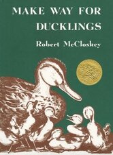 It’s rare for a title to reveal the story problem or the plot, but here are more examples. Robert McCloskey’s Make Way for Ducklings states the plot, plain and gentle. On seeing the title, we know the ducklings need to get from here to there. (Though the storyline's much more involved.) With H. A. Rey’s Curious George the problem is inherent in the mischievous monkey’s name. Well done, for an author who has fun with names. His own, for instance. In one stroke, Agatha Christie’s Murder on the Orient Express tells us everything but who done it and why. The Spy Who Came in From the Cold cloaks the plot in simple yet literary terms, while staying true to the nature of the subject by making use of the Cold War metaphor. (A fascinating aside: The term “cold war” was first used by George Orwell at the end of WW2 to describe the shadow of nuclear threat between the Soviet Union and the West, and “tepid war” appeared in the fourteenth-century writings of Don Juan Manuel, describing the conflict between Christianity and Islam.) Robert Louis Stevenson’s Kidnapped captures it in one word. But until we read it, that’s all we know. One Flew Over the Cuckoo’s Nest presents the plot in an appropriately cryptic, if not psychotic, way. It’s a beautifully symbolic choice, and is actually taken from a children’s jump-rope rhyme. 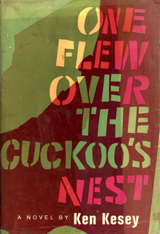 Vintery, mintery, cutery, corn, Apple seed and apple thorn, Wire, briar, limber lock. Three geese in a flock. One flew east, One flew west, And one flew over the cuckoo's nest. Here’s one more, a movie title. Saving Private Ryan tells us the plot in simple terms, and gets us asking: Who is Private Ryan? Why must he be saved? And later, Is he worth it? All compelling reasons to watch the film. A word of caution for my writer friends. Stating the situation in the title is not usually the best choice to make. It depends on a number of factors: genre, tone, pacing, world building, character development, theme. The Wind in the Willows, for example, creates the lovely, dreamlike tone it’s known for, while giving us its natural setting. The Adventures of Mole, Rat, Badger, and Toad would not have accomplished that. What's important is that the sooner you reveal the main problem, what the protagonist wants, and what’s at stake, the better your chance of engaging the reader. The sooner they care, the more willing they’ll be to spend time (and money) on what you’re offering. Above all, make it more than worth it. Make it a gift. To read more about Whale in a Fishbowl, please go here. Whale in a Fishbowl art by Richard Jones / One Flew Over the Cuckoo’s Nest cover design by Paul Bacon / Make Way for Ducklings art by Robert McCloskey
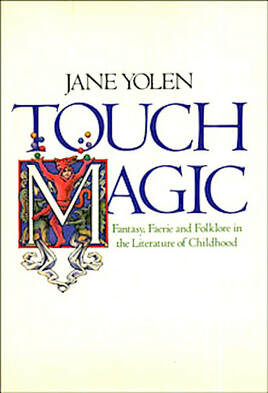
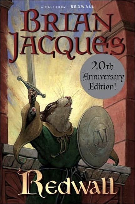
TOUCH MAGIC: Fantasy, Faerie, and Folklore in the Literature of Childhood by Jane Yolen If you’ve ever doubted the importance of folk and fairy tales — and I know some confused adults who have — get this gem of a book. You will be charmed, provoked, enlightened, and soundly convinced of the benefits fantasy plays in our lives. “We must watch our language, we must preserve our stories, we must guard the magic that is inherent in imagination.” 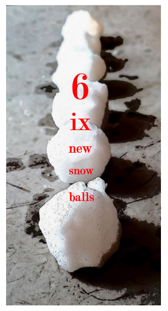 For my year-end project I’ve made a small pile of snowballs, some hard-packed, some light, that I’m tossing your way. Snowballs are a form of poetry that begins with a single-letter word and builds from there, with each consecutive word having an added letter. They can melt back down to a single-letter word again. For anyone who’s tried this, you know the challenges: single-letter words, even double-letter ones, are scarce, and assembling a set of words that ends up making some sort of sense is not easy. You find ways of making it work, bend the rules, play around. I’ve also formed each one into a concrete poem, where the shape or format illustrates the subject. I hope they don't leave you cold. You might try catching them rather than getting hit, because one has a rock inside. (Please see Notes following the poems.) You might even try your hand at some and toss them back to me. I'd love to see what you come up with. If you want to read more, here are five I wrote in 2015. May you thrive in 2019, friends. 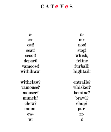 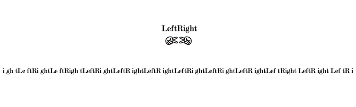 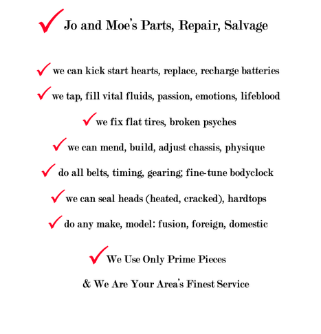 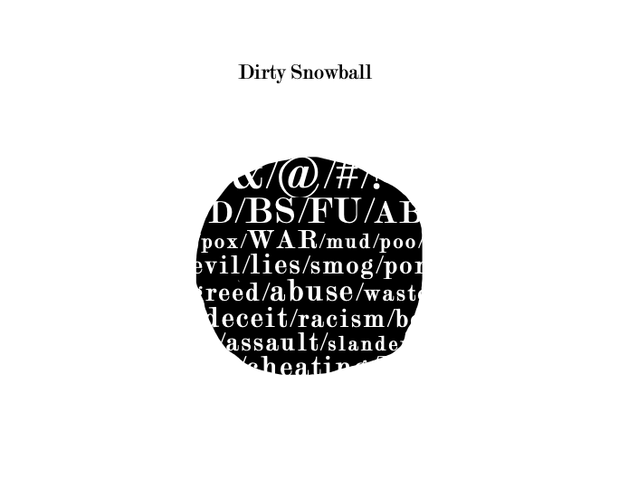 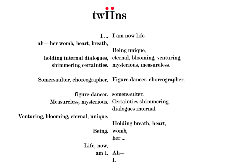 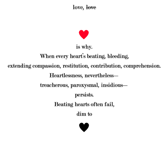 NOTES “Cat Eyes” is a conversation between a cat and its owner, who wants the cat to leave the mice alone. Guess who wins. “LeftRight” illustrates the clash of two extremities that converge at times but never become compatible or constructive. I’ve left it strictly black and white, though the addition of red would work well. Also, like “Twiins,” it begins and ends with “I,” but for altogether different reasons. In today’s confused mix of technology and humanity, a body shop like “Jo and Moe’s” (whose title is a snowball, as well as each line in the virtual checklist) seems a logical solution. Or it may be a case where logic no longer exists. “Dirty Snowball” speaks — or strikes — for itself, covertly delivering a rock. In an actual snowball fight, such devices are for bullies. In “Twiins,” I’ve placed two snowballs back-to-back that build from a single-letter word to a 13-letter one (choreographer), and return to a single-letter. The shape is meant to convey two entwining lives in the womb. We all have heart conditions, and those conditions are individually up to us to maintain. For an interview with Howell and a commentary discussing his work for the jackets, see links below * At her Philomel office in New York, 1985, editor Patti Gauch handed me a manuscript simply titled Redwall and said, “I think this is for you.” That was the beginning. From then on, I mingled once a year with the creatures in Brian Jacques’ imagined world, attempting to convey pictorially what he so richly conveyed with words. That first novel was originally written for students at the Royal School for the Blind in Liverpool, Brian’s hometown, and the needs of his readers set the descriptive and dramatic voice he became known for. 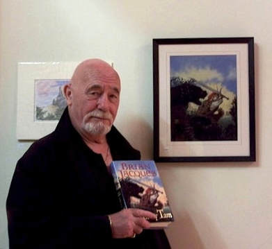 Brian, next to my original art at an exhibit and book signing. I illustrated each of the 22 book covers in the series. Brian was a storyteller of the highest quality. He could dazzle a crowd with tales both real and make-believe. On his American debut tour, when he and I first met, he captivated an audience of children so deeply they responded to his every gesture. One moment he was leading their crescendo of excitement, the next stilling them with a motion. On a few occasions Brian and I lunched together, and his love of good food was evident. Anyone familiar with his stories knows how feasts play a delightful part. He was fond of bread pudding, and when in the States he missed tea made the English way, with leaves steeping in a preheated pot, a pleasure we had in common. He also loved music — he was a musician himself and had formed a folk band in the ’60s — which also explains how song plays so easily throughout his books. He would readily sing lyrics or quote lines of poetry. We discovered we both encountered disbelief from teachers in grade school regarding our abilities. I had been openly ridiculed in class more than once for alleged plagiarism; he had been accused of the same crime but with worse consequences: a caning. Brian had compassion for the underdog. That’s what his stories are about — the triumph of the innocent and oppressed over the oppressor. He wanted to fill children with courage to stand up to bullies and be heroes in their own right. He died in 2011 at age 71.
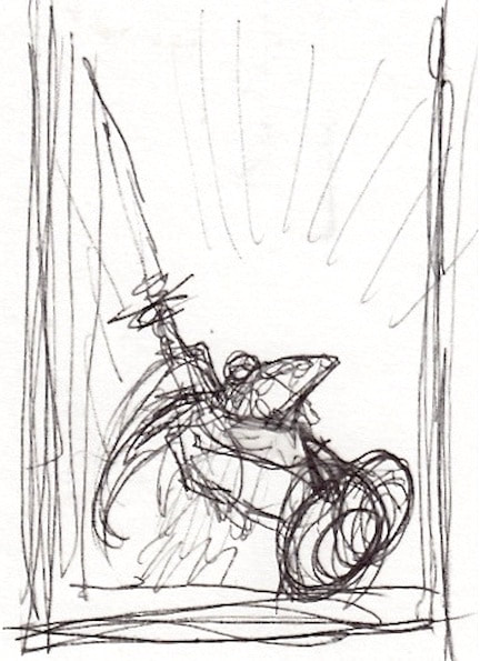
The first concept sketch for the cover. The original art for the 20th Anniversary Edition, featuring the “unlikeliest of heroes,” Matthias, wielding Martin the Warrior’s sword, is in Brian’s private collection, as is the art for Marlfox. 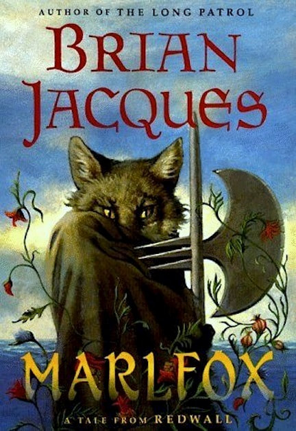 My favorite cover. A master of concealment, this antagonist is part fox, part vanishing act. The eyes are actually those of my cat Noir, who vanished one day after having been a good poser for 17 years. 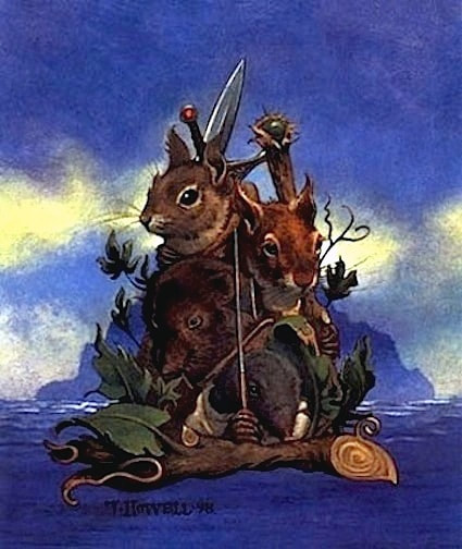 The back cover, also a vanishing act. These little creatures and all the wraparounds were replaced by a photo of Brian, so that halfway through the series I illustrated only the front covers. 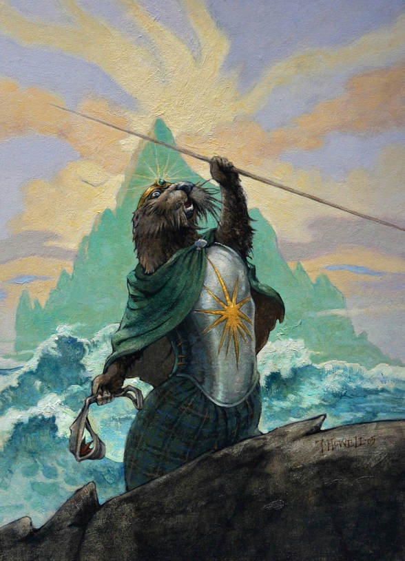 The ottermaid Tiria Wildlough in High Rhulain. Many thanks to Patti, always. And to my art agent Dilys Evans, founder of The Original Art exhibit. All images in this post © 2021 Troy Howell All text in this post © 2021 Troy Howell   For Redwall fans, Urban Outfitters is offering the 10th Anniversary Edition cover art in their "Out-of-print Ts" collection. Click on the Ts for the link. |
categories |
|||||||||||||
 RSS Feed