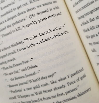
That’s right. It isn’t, wasn’t meant to be. It’s what happens when book jacket designers don't have enough information. I created the art for the tale I wrote, where the first-person narrator and main character Kat says the dragon Ye is not gr — and stops herself. She doesn’t want anyone to know about her beloved friend, the last one on earth, who wishes to die in peace. Or live forever. Unfortunately, Kat thinks she’s already made that decision for him.
At great personal cost.
The Dragon of Cripple Creek is currently out of print, but please grab (politely) any copy you might come across, and enjoy. I worked a year on it, believing it worthy to spend a quick afternoon reading, experiencing Kat's world. Though her world is very like our own, there is this dragon ... (Ye is whispering in his smoker’s voice, “It was our world first.”)
No, the dragon isn’t green. Reader kids have told me that. They notice when things don’t make sense. The final jacket works, it's just not true to the story. The original concept was to include a faded "Wanted" poster, but it's lost to the main image, so the dark background was a good choice. Problem is, this dragon isn't gr —
I hope to get the book back in print before long, and I'll have the cover redone.
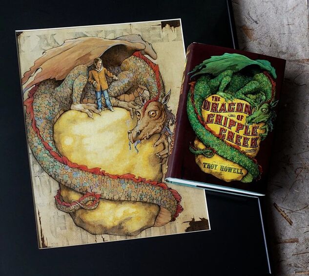
The digitally-altered jacket next to my actual art.
 RSS Feed